 Insight

We usually associate data as numbers. Scary words like average, mean and percentages are thrown into the air. Numbers are important to us, but the human brain cannot easily grasp large numbers and we are bombarded by figures and ‘facts’.
To bring clarity and meaning to what we find in data and why it’s important, we need to use stories. This is why presenting the data through storytelling is an integral part of the data pipeline.
However, storytelling is an art of its own – creating good plots with twists and conflicts that resolve at the end into something inspiring for those who wish to inform or influence.
We have been thinking about this a lot here at 360Giving. We run ‘questions workshops’ which help people think more specifically about the questions they can ask of their data. Having clarity on the questions you want to ask and what’s possible to discover from a particular dataset helps when the time comes to do the data analysis.
But what do you do once you have findings? How can you bring them to life?
After reading some useful reports about storytelling like The Story Behind the Story (by Jed Miller and Alison Miranda) and listening to the BBC podcast The Tyranny of Story, we created together with FabRiders a workshop format that aims to make you a better data-storyteller!
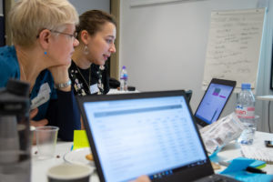
We trialled this approach at our Data Surgery in December 2018 with 20 grantmakers.
Originally posted here